Artist Statement
In the presentation Redesigning America’s Flags: Six New Takes on Old Glory, they asked various artists and designers to create redesigned versions of the American flag. “The American flag is a potent piece of national iconography, but its design shifted frequently until the early 1900s. What if it were redesigned today?” The concept for our class’s flag design was to create a flag for a utopian society, but the presentation’s project of having artists explore alternatives for the traditional American flag got me interested in exploring a more substantial fictional flag. I find that working with fiction becomes more interesting when it has some type of grounding from aspects of the real world. This same question, along with my sister’s Mexican history learning for her class (she would share with me her amazing findings), inspired me to ask a similar question: What would the Mexican flag have looked like if the country had never been colonized by the Spanish?
For my own flag, I really wanted to pull from native american believes and culture, since in this fictional Mexico, the native american believes would be influencing the design of the flag. While some artists from the flag presentation had made more artistic renditions of the American flag, I really wanted to pull from the other ones that had made their flags more functional. The ones that made more functional flags shared a similar pattern of taking inspiration from the American values, beliefs, and even political causes, so for my own flag, I wanted to show the respect that the native americans showed towards nature, their spiritual beliefs, as well as symbolic and sacred structures, like the known Mexican temples.
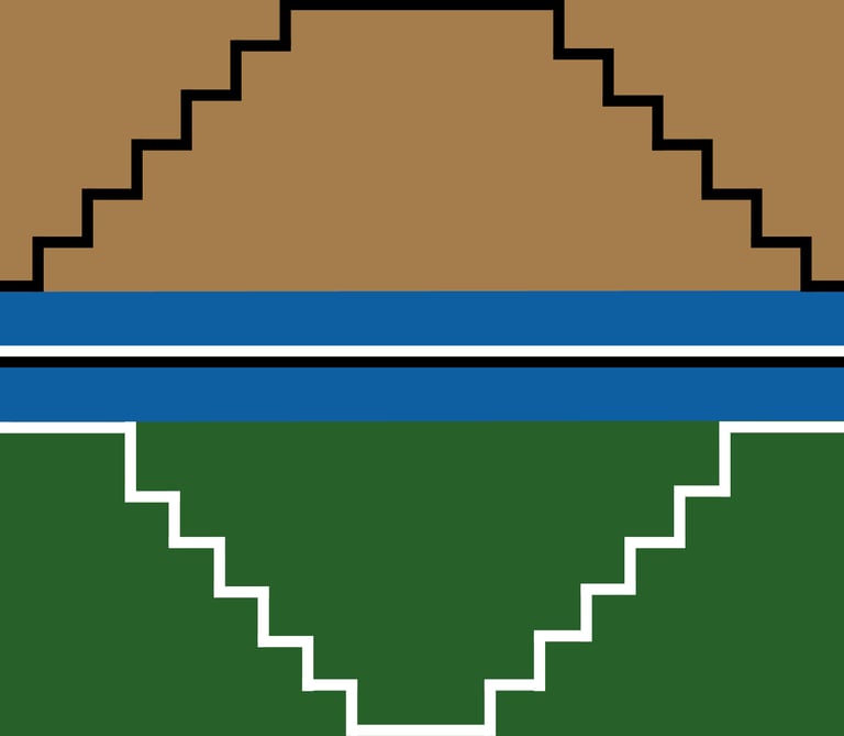
To represent the diversity and richness of pre-Hispanic Mexican culture and nature, I made the top part of my flag brown to represent the northern parts of Mexico is mainly desert. The silhouette of a tower on the brown part represents the mountainous terrains and adobe work, such as pottery and houses. The green part of the flag represents the southern parts of Mexico, which are mostly jungle. The blue ribbon in the middle represents the diverse bodies of water from Mexico, rivers, lakes, waterfalls, and the coasts. Together as a whole, it represents how nature is sacred to the Native Americans, and it is at the front of their values. The black tower also represents the city of Technotitlan, which was built on an island in Lake Texcoco in 1325 due to a combination of religious prophecy, strategic necessity, and superior agricultural technology. The two white towers at the bottom represent the Mexican temples, but also the volcano Popocatepelt (the 2nd biggest volcano in Mexico, which is still active) and Iztaccihuatl, the White Mountain, next to each other. The white and black lines in between the blue ribbon represent the feminine (white) spirit and the masculine (black) spirit, which represent how spirituality, wisdom, and religion are important in Native American cultures. Community is important to ensure the success of the nation and local tribes; that is why the white and black lines are next to each other. The inverted white and black lines on the towers represent how the feminine and masculine spirits are part of one, complementing each other, while they are opposites of each other. The four steps of the temples and the mountains represent the four elements, as they were also important in their culture.
This flag represents a lot to me as a Mexican myself and as someone who is three-quarters Native American, because I got to explore that part of me that is lost culturally in Mexico. Even though we still keep some Native American names for certain things and words, sadly, a lot of Native American practices and languages have become irrelevant or nonexistent. I felt that through this project, I was able to honor a part of my roots that I often feel distanced and disconnected from. When it comes to the actual practice of painting this flag, I was a bit nervous since I don’t have a lot of painting experience. I originally wanted the brown color to be lighter to represent more of the deserts, and accidentally made it darker. Which, now that I think about it, actually goes well with the darker green that I went for to represent the richness of greens from the Mexican jungles. I am really happy with the result, as I really wanted to pull out from the vexillology article on good flag design, and really thought out the symbology components of each aspect of my flag. I enjoyed the journey of structuring and designing an art piece for functional and symbolic purposes, and answering my personal question that I got from this experience made the project more meaningful.
Cited Work
Opinion, Compiled by The New York Times. “Opinion | Redesigning America’s Flag: Six New Takes on Old Glory.” The New York Times, 28 Sept. 2021, www.nytimes.com/interactive/2021/09/28/opinion/america-flag-design.html.
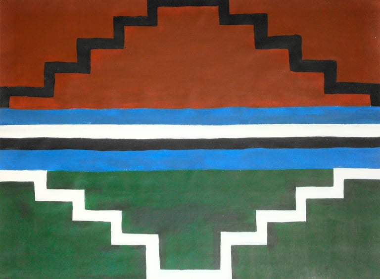
A different Mēxihco (meh-chee-ko), 16'' x 20'', 2026
acrylic paint on canvas paper