

A Week's Weather, 8.5''x11'', 2026
vellum prints on seven picture frames, black cardboard, wood scraps, black paint
Artist Statement
In the This American Life podcast episode 110 on Mapping, the interviewer, Ira Glass, interviews various artists on their unique mapping process. As Glass observes, “Maps have meaning because they filter out all the chaos in the world and focus obsessively on one item ”. As humans, we tend to quickly summarize a person, a book, a movie, or even a place instead of pausing to observe the details. Especially as artists, who tend to imbue our art with general symbolism and meaning, mapping becomes a challenge. I was intrigued by this very same challenge of exploring what it takes to put your mind on one simple task. Another challenge presented was the fact that the world offers thousands of options for mapping, so I chose a simple task to adhere to the mantra of the quote on simplicity: the weather.
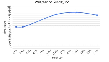
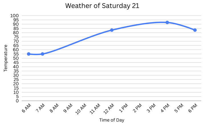
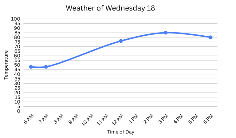
I chose the weather only after I envisioned the artistic interpretation. I developed the idea of doing some kind of layering with transparent paper, so that you can see the relationship between the individual in correlation with the whole of a specific data set. I was also interested in exploring the making of a 2D artpiece seem like it is 3D. Upon long wandering, I thought the weather fit my proposed idea because it needed to be more abstract, and atmospheric shifts can be easily represented with color. Even though other fellow artists, including myself, would have wanted to represent something more complex or even more meaningful, I decided upon mapping meteorological data, not only for the previously aesthetic purposes, but also because of one of my thoughts: “Why not make something deemed as simple, factual, and boring, and convert it into something different and creative?” With that said, I think the weather deserves an artistic rendition, as it usually gets repetitive and factual renditions from the weatherman.
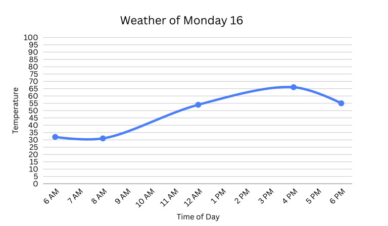
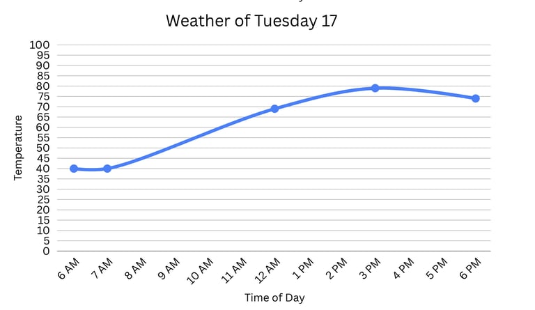
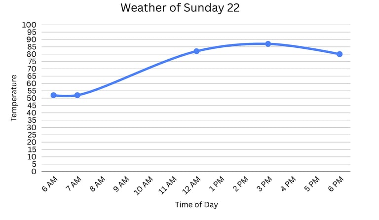
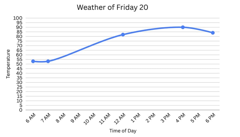
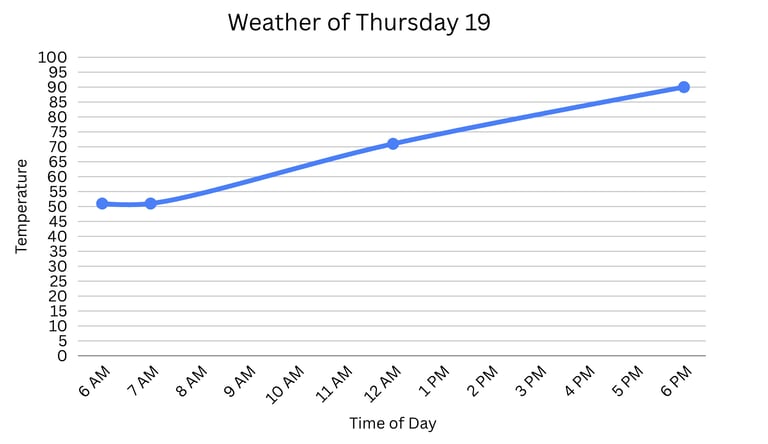
After the completion of my vision, I wasn’t satisfied with the visual clarity of the front view of my art piece because of the technical choices that I made. I had hoped that the front view would be the view of the overall week’s weather, but by making increments of 5 degrees for the weather data, the vertical fluctuations of the graph weren’t as drastic as I had hoped for. Upon observation, I should have experimented more with the look of the charts prior to the artistic interpretation of them. I believe that if I had made the weather data on a larger scale, such as by 10 or 15 degrees, the dramatic effect that I was hoping for would have been more apparent. In order to solve this issue, I experimented a bit with the spacing in between each frame and decided upon creating more distance to create clarity by the use of woodblocks glued in between each frame. Such spacing allows the viewer to observe the individual weather of each day more clearly, and it also offers different viewing perspectives from different angles to observe the overall weather for the week. Having a visual representation of a week’s weather was a curiosity that I fulfilled with this project. It is fascinating how the weather is pretty similar overall, but with some differences fluctuating each day. This resulted in the individual pieces having their own unique “code” of color fluctuations. I began noticing patterns, such as the early morning and afternoon having similar weather temperatures each day, which makes my art have a sort of scientific flair. Focusing on a single data set helped me visualize the impact of data keeping on a grander scale, as the week I chose to track was part of a record-breaking nine-day heatwave where temperatures reached 90 degrees Fahrenheit, transforming my abstract art piece into a historical record of that event.
Cited Work
“Mapping.” This American Life, 4 Sept. 1998, www.thisamericanlife.org/110/mapping.